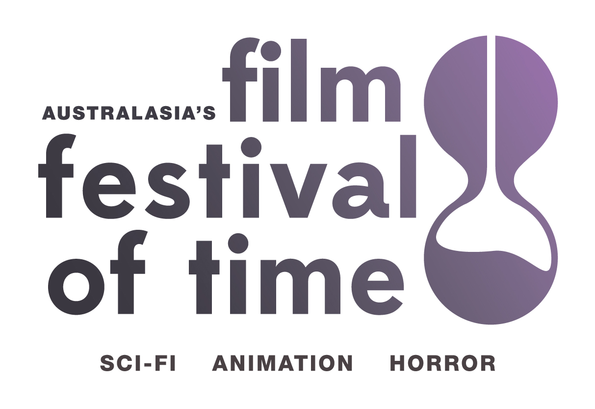
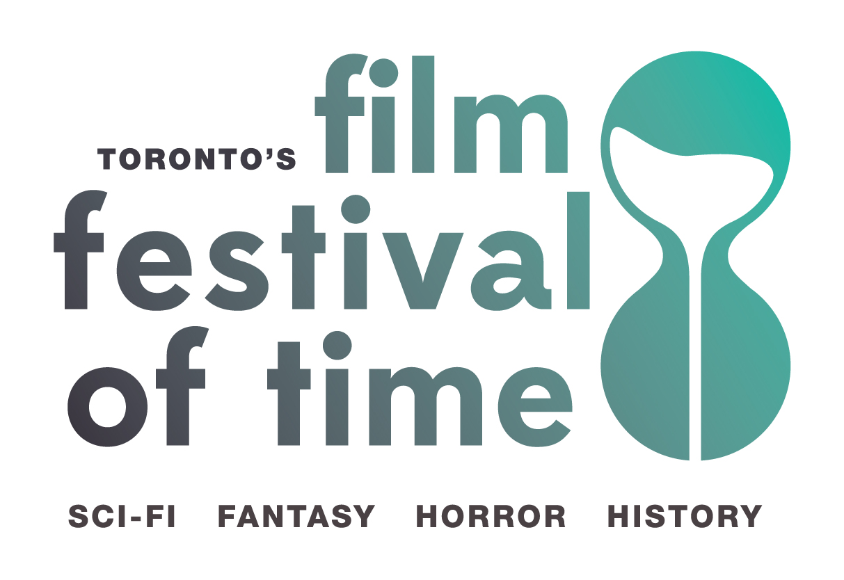
Logo Design and mark re-fresh for Toronto’s and Australasia’s “Film Festival of Time.”
The challenge here was we needed to bring a fresh look to the brand but incorporate a variable for the two locations.
We had to utilise the iconic hour glass that had been the corner stone of the brand, but from there the brief was open.
After some play, we ended up pondering… what if the sand in the glass didn’t fall into the bottom… but kept going, somewhere, into a mysterious void of time… and that’s where the icon and logo direction went. Simplified and modernised with a twist, all incorporating the spirit of the film festival.
The variable arrives when one turns the hour glass up-side-down and the sand runs up.. again a fun play of the idea of “time” and the perceived direction it can travel in.
Brand consultation.
Graphic design.


