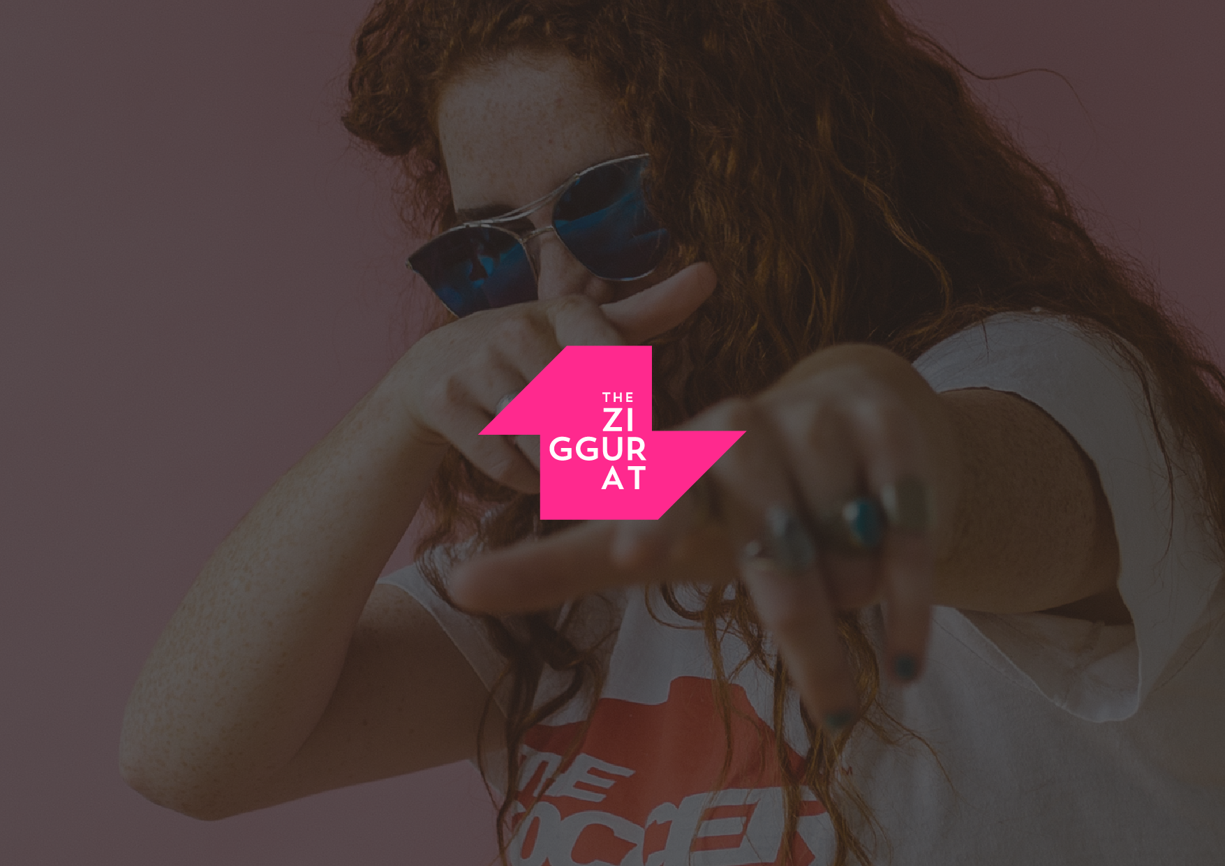
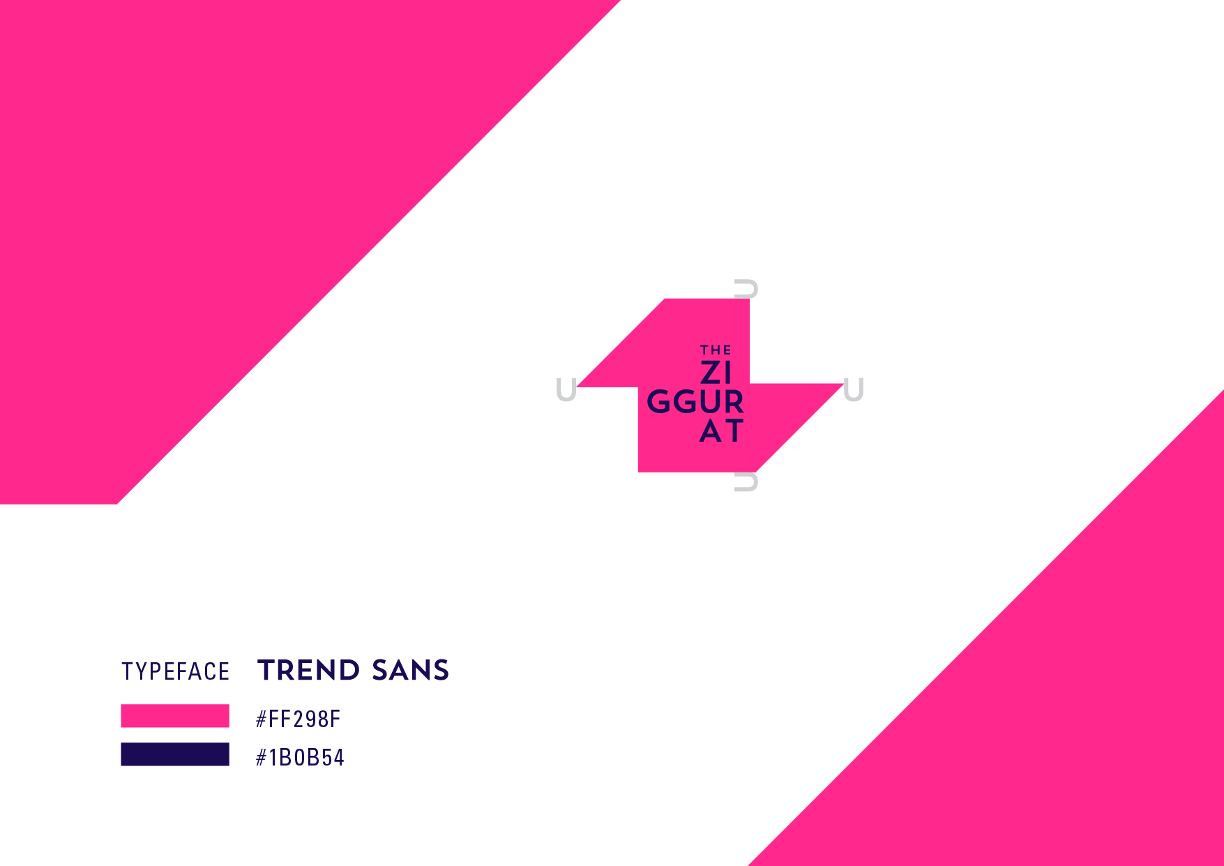
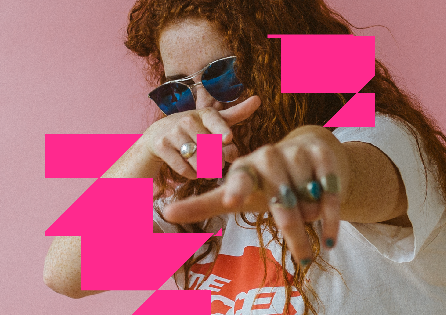
We’ve been working alongside Jonathan for a wee while now. Assisting him with his vast plethora of film and media presence and ventures. The Ziggurat is his latest umbrella brand that houses his endeavours. The logo needed to be “now”, punchy and bold, and stand on it’s on.
It’s angular, bold Z, draws inspiration from the building blocks of the historic Ziggurats of times past. Their stepped, zigzag structures that form their strength and powerful presence gave rise to the form used which also coincided with looking like a Z.
The simple typeface alludes to modern day minimalism for a sense of timelessness.